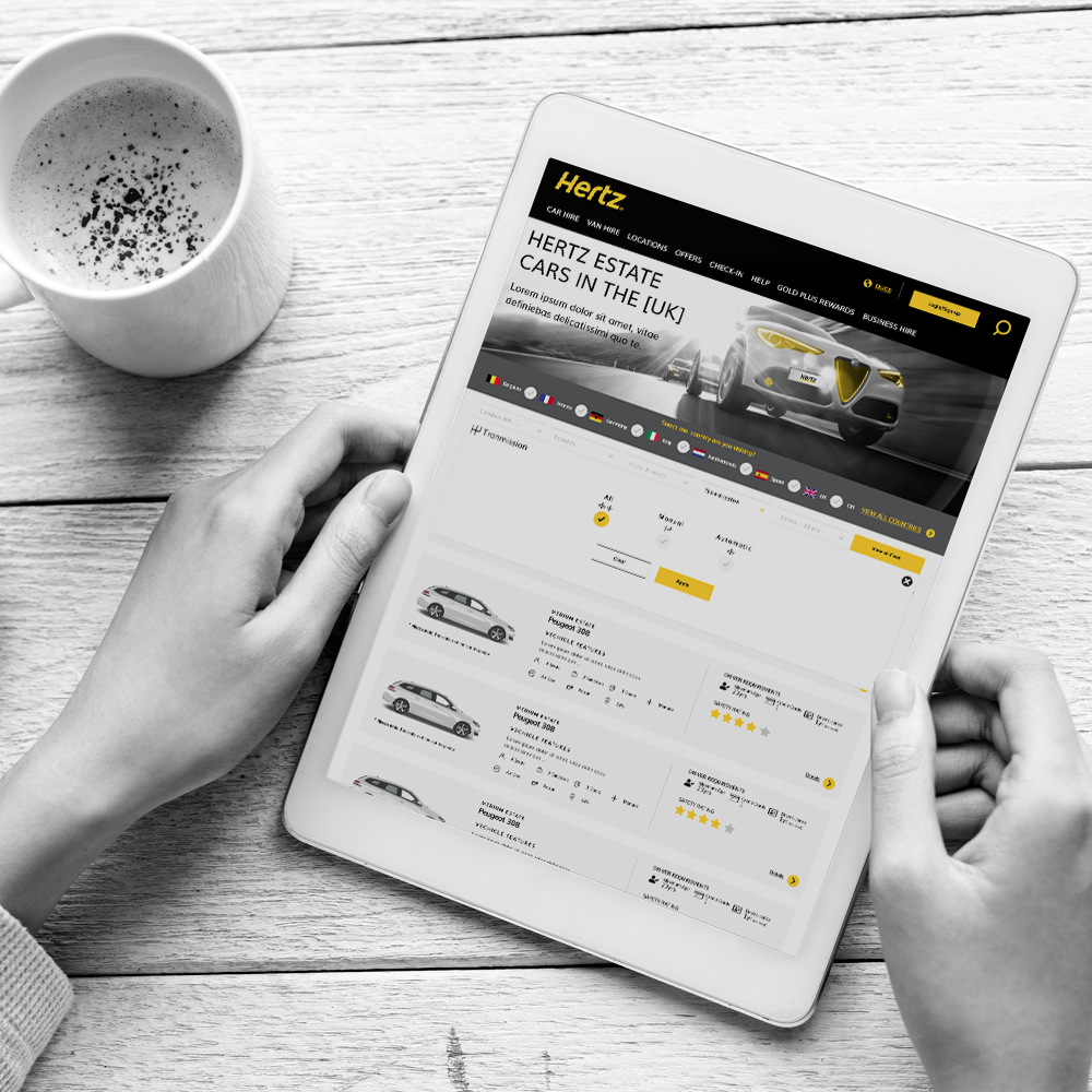
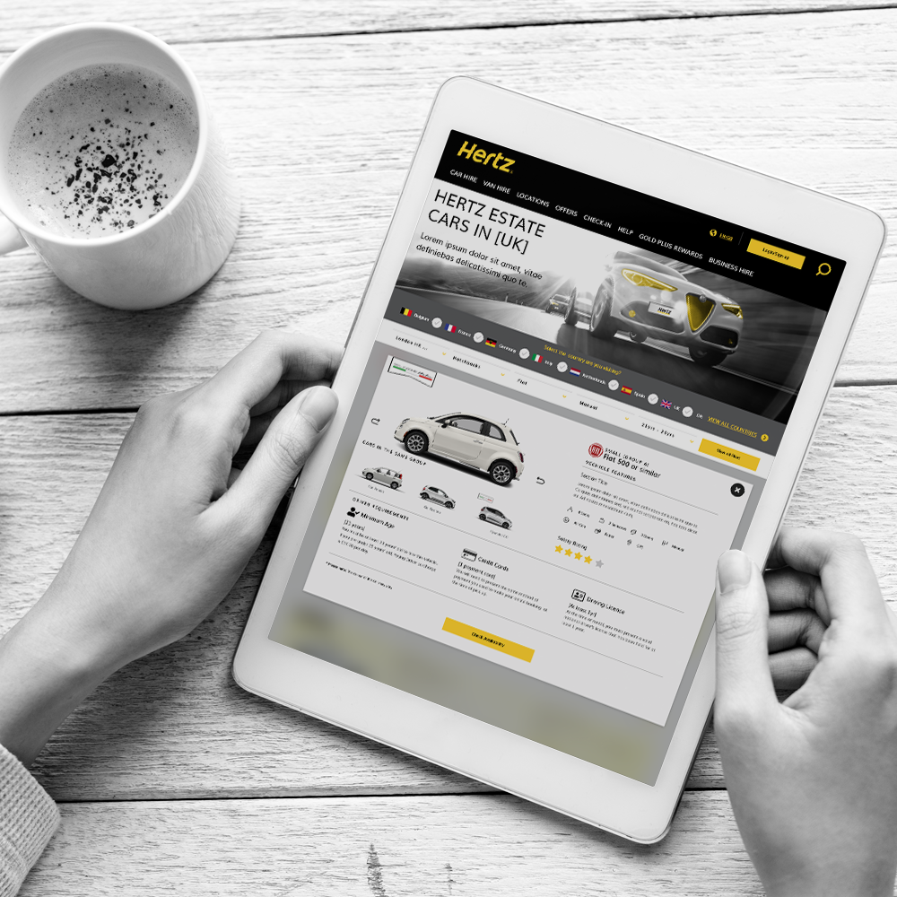
Hertz Vehicle & Fleet Guide New Design
Why?
HERTZ UP-SELL, CROSS-SELL, DIRECTION CHANGE
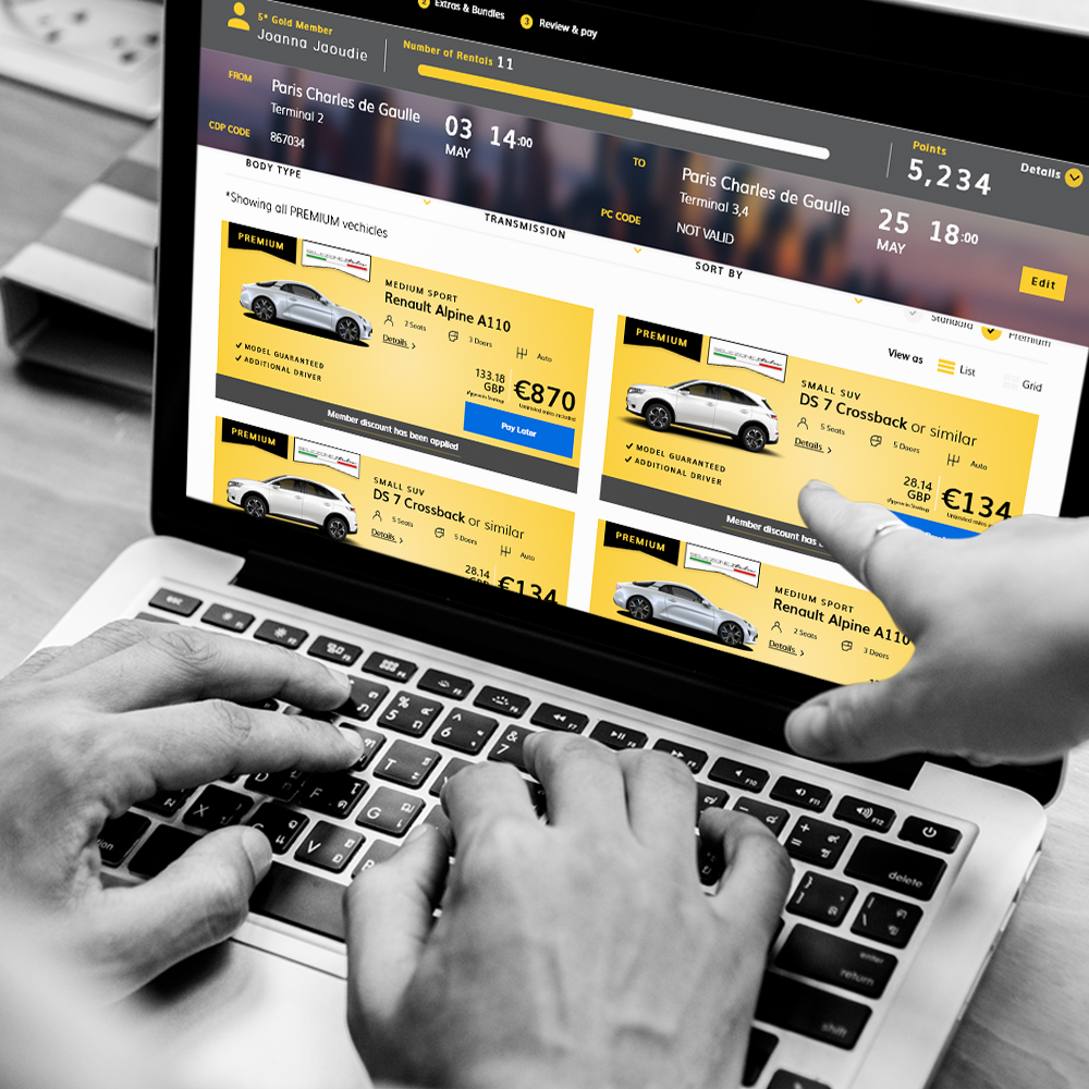
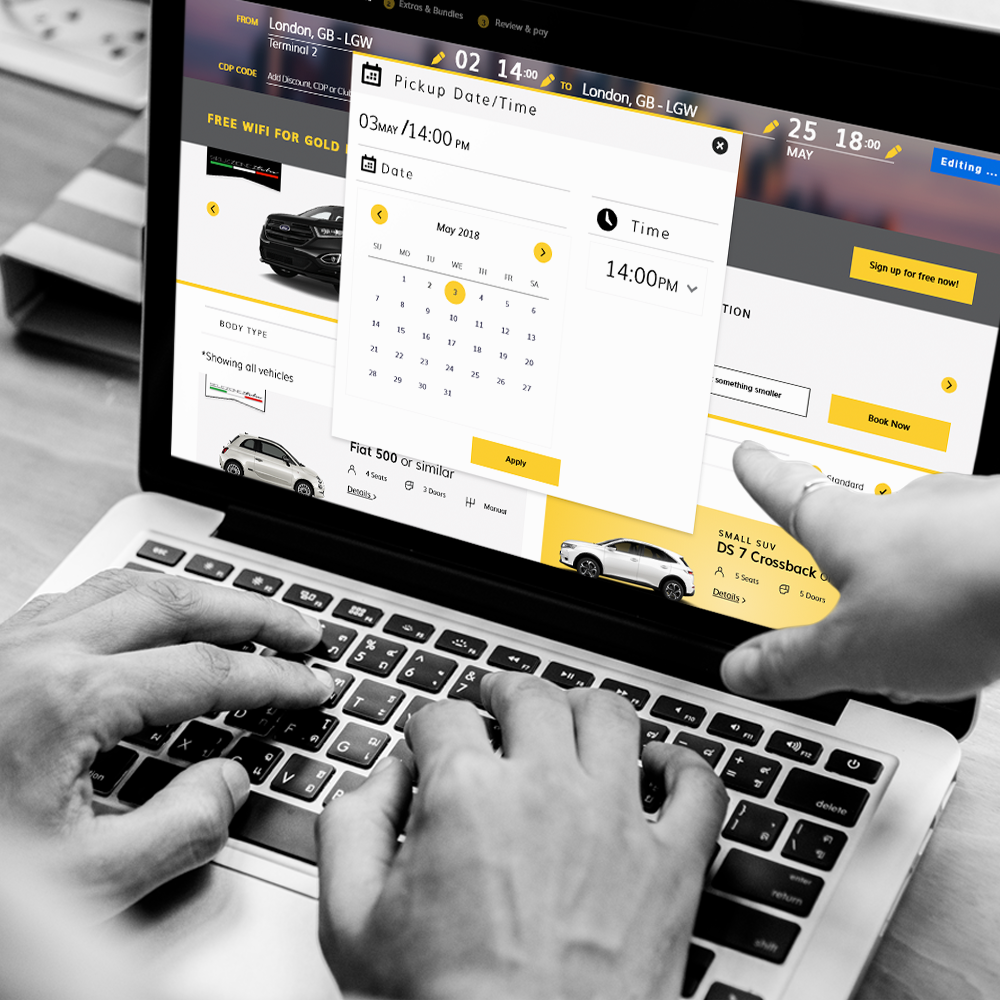
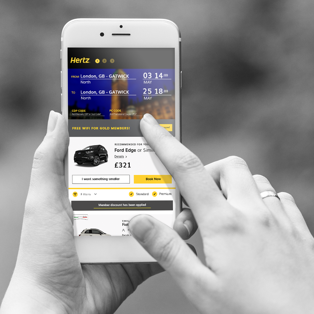
Hertz had shifted their business model, which meant a complete redesign and updated layout of all there online digital foot print. Hertz wanted their customers to be able to compare the price of standard vehicles to that of the premium vehicles. Thus understanding the benefits of renting Premium and Standard Vehicles, the business up-sells, the user receives a wider vehicle rental pool.
This was a multi-million pound project for Hertz as the Premium fleet needed updating and increasing Europe wide. We worked directly with the European Vice President, keeping him updated daily with progress.
INITIAL IDENTIFIED ISSUES
Not enough vehicles
Out-of-date infrastructure, (update in progress)
Technology restraints for the UI design
What?
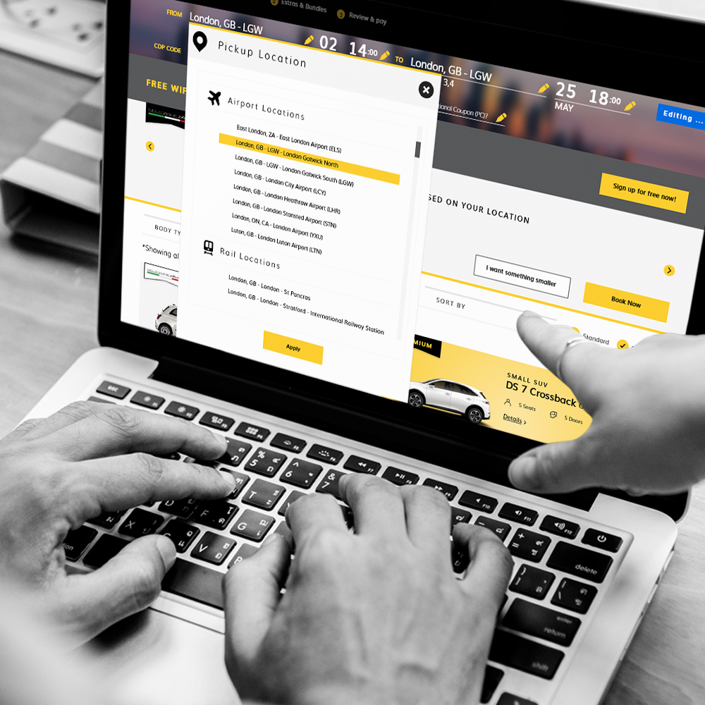
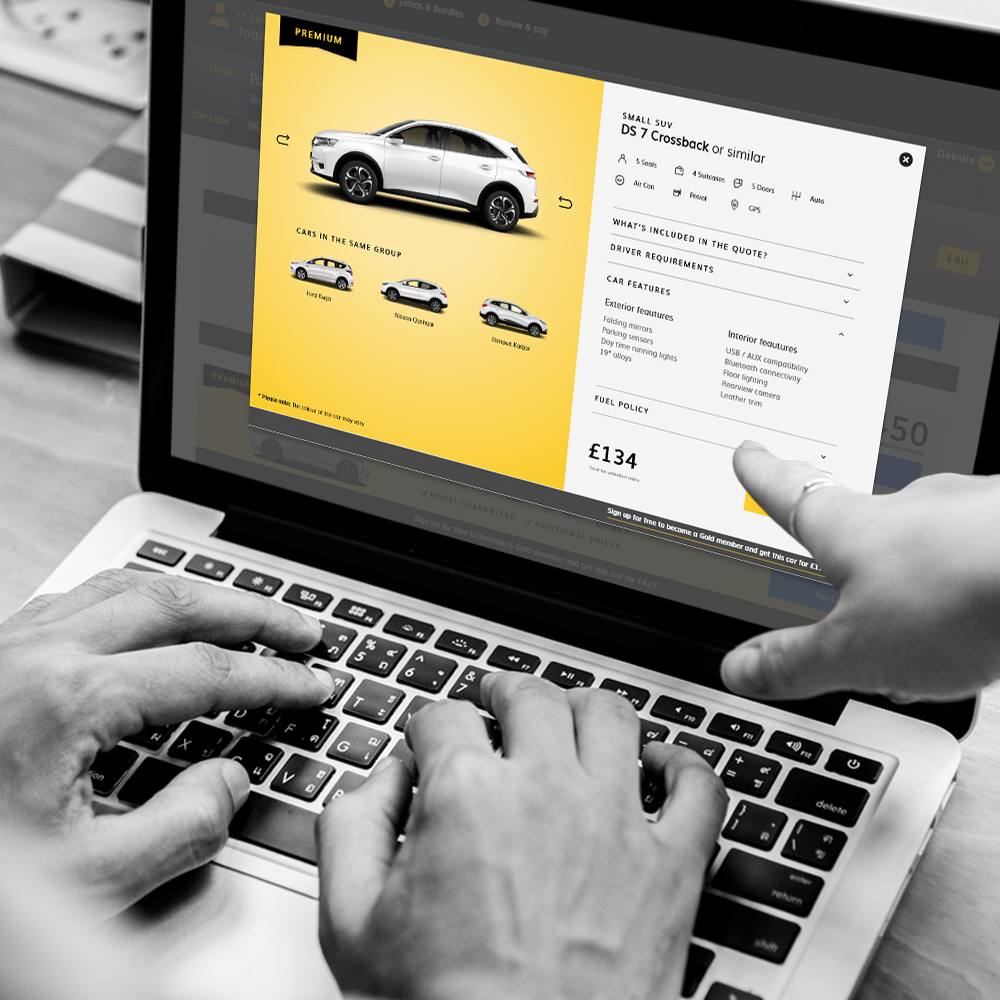
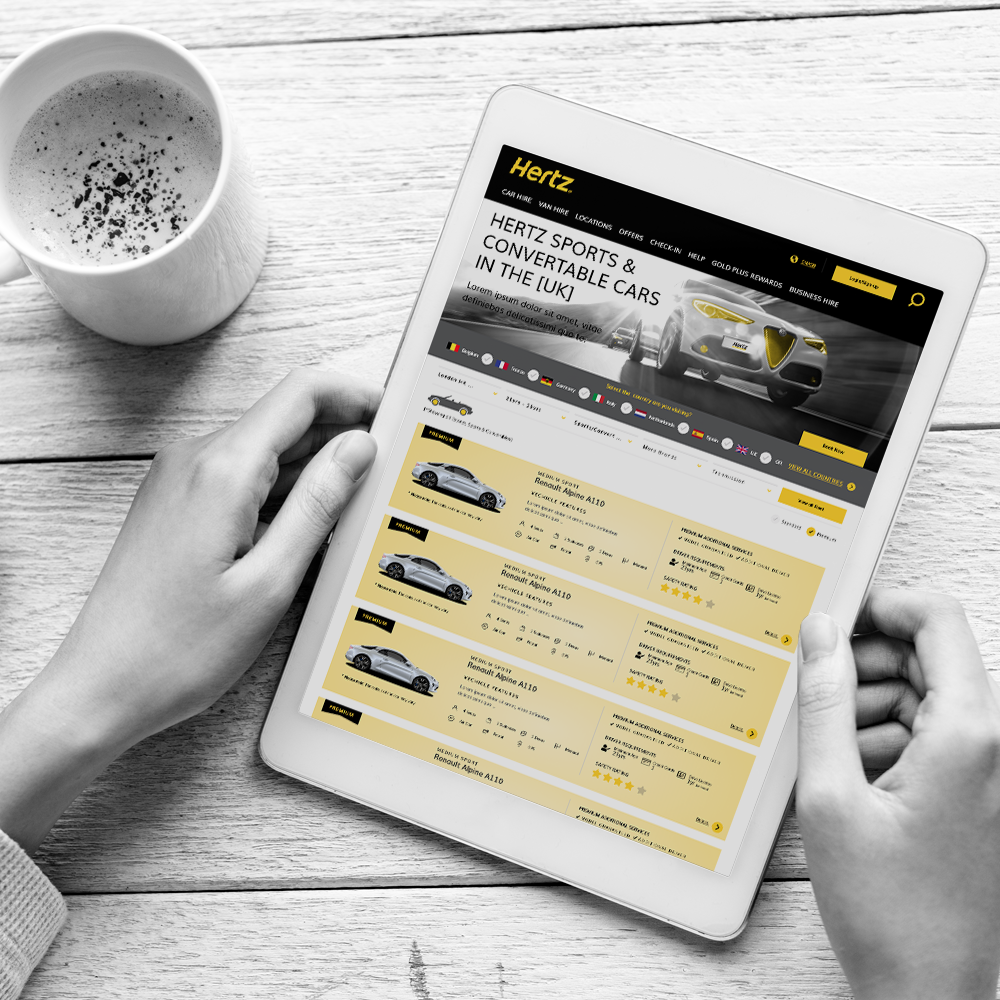
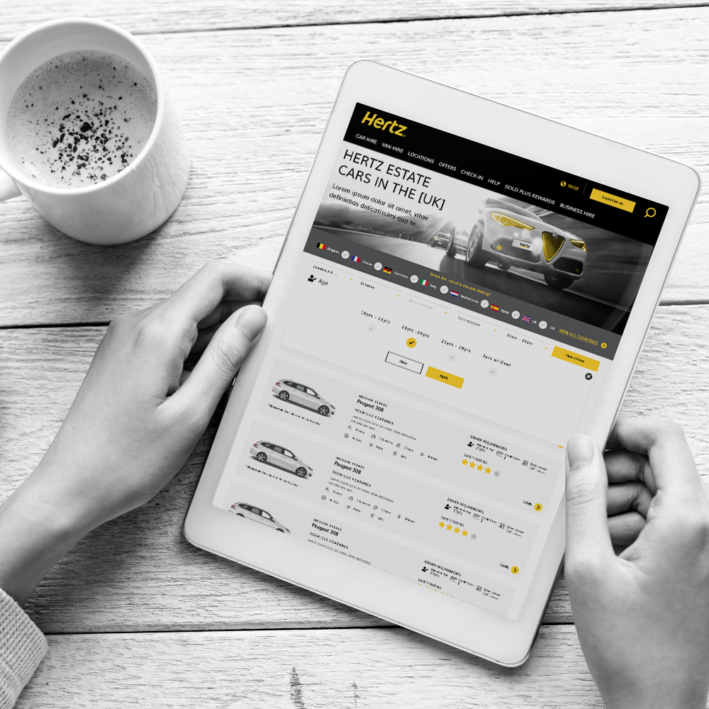
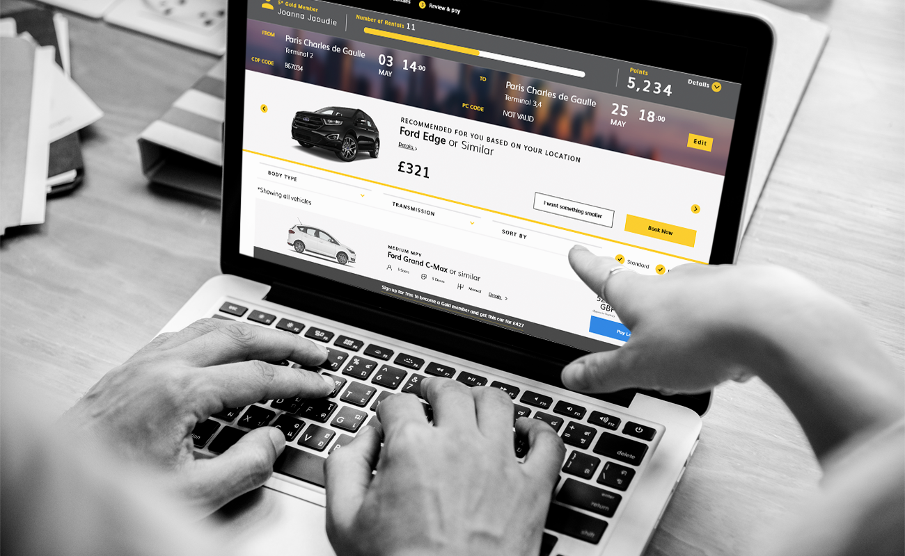
DESIGN & UPDATE FOR HERTZ WEBSITE, 2ND, 3RD SCREENS
New narrative & using journey
Incorporate new branding into design thinking
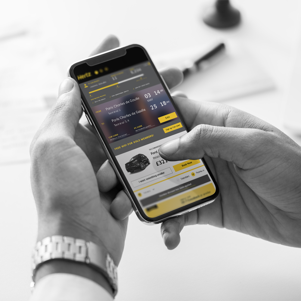
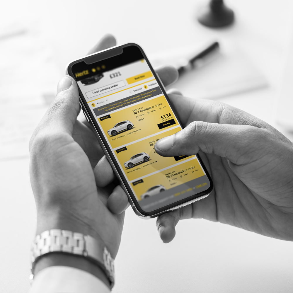
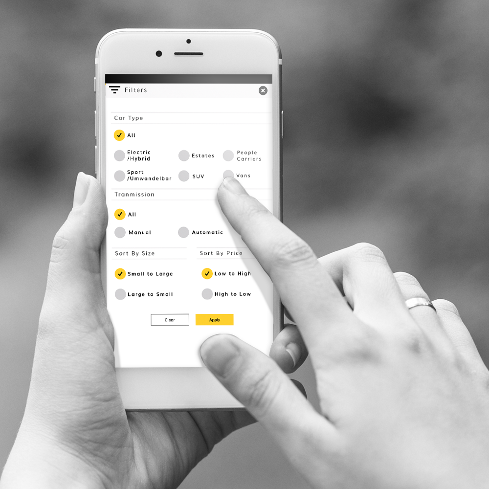
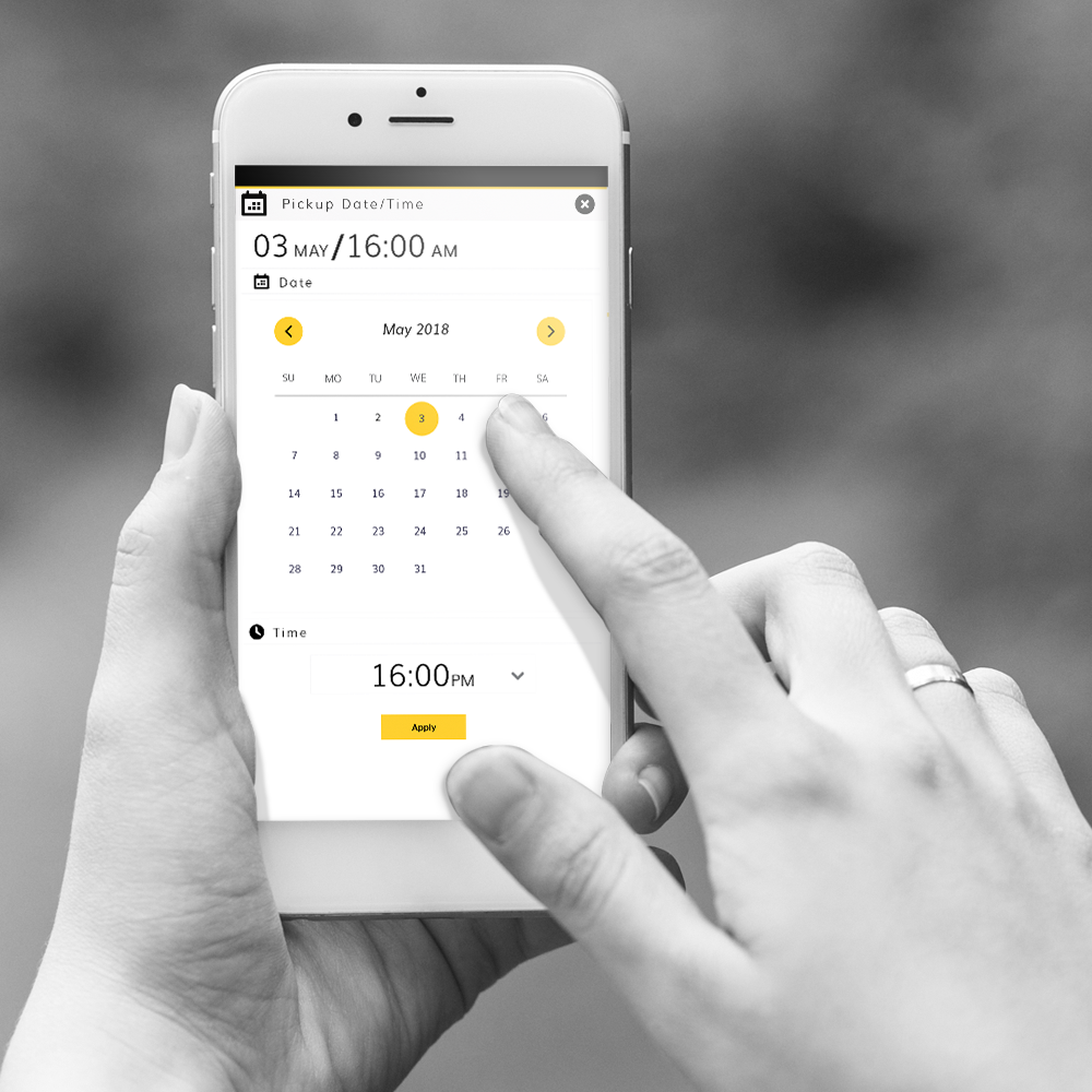
New Adaptive Layout for Mobile & Web
New contemporary, considered design.
New simple compare layout
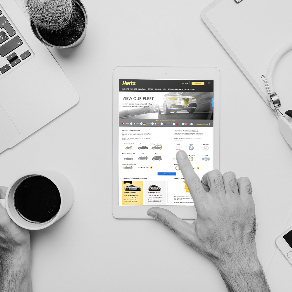
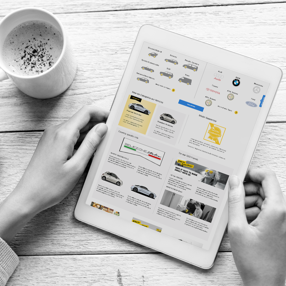
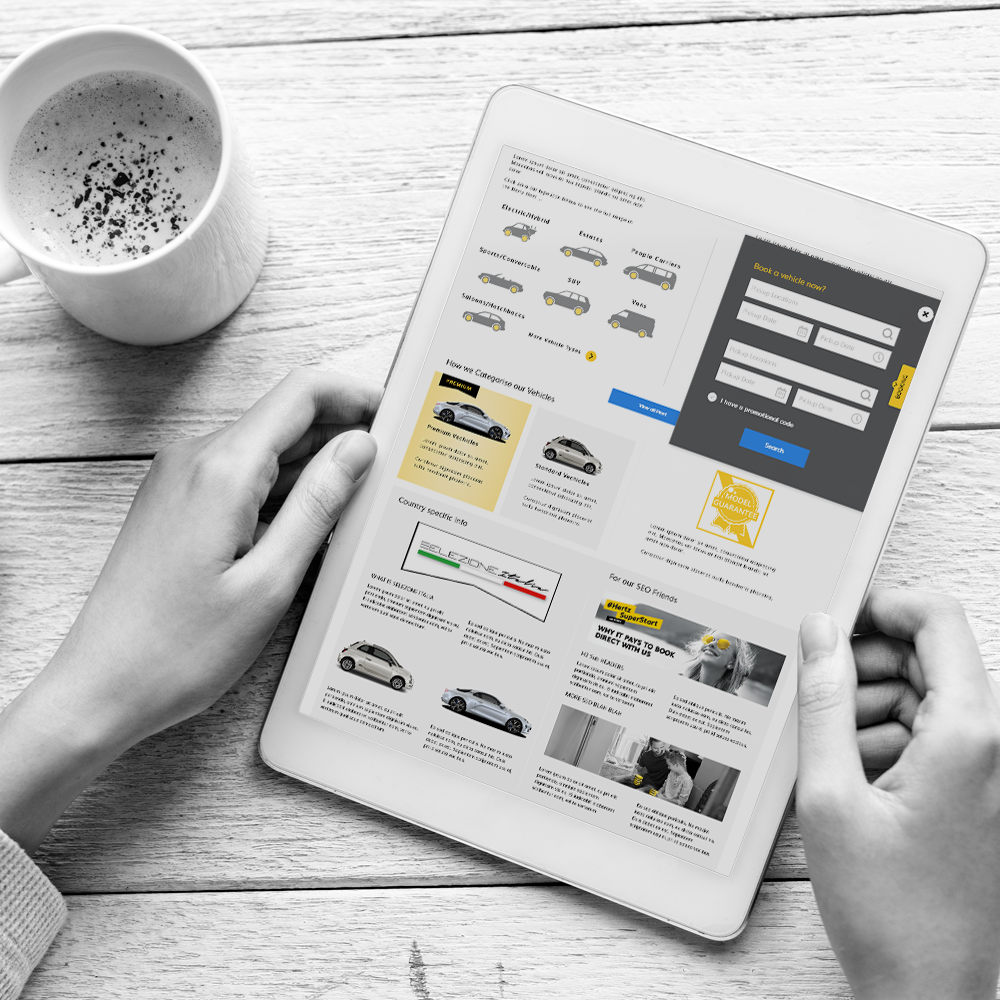
New Fleet Guide
Where?
CLIENT
Hertz
PROJECT INFO
Lead Paul Cleghorn, (Contract)
WHAT WE DID
User Centered Design, User Interactive Design, Visual Design
Empathize & Define
Project Start
IDEATION, RESEARCH
The Hertz Vehicle detail pages had already been started when we were brought on-board. This meant all the research had been completed and we could hit the ground running.
Hertz Fleet Guide was a greenfield project, due to time constraints we conducted a guerrilla ideation and sketching session. This ensured we quickly understood the narrative, user and business benefits and team input.
We worked with multi-functional departments, from the outset. This guaranteed a lot less feedback and changes at the end of the project.
Technical Issues
TECH LAG
Before the start of any Interactive Design or Visual Design took place, the technical restriction had to be understood. Due to database issues we were unable to add the usual level user interaction and persanlisation to the design normally expected.
But using experience gained from designing before these newer systems were in place, we were able to mask these problems.
Delivering Final Designs
SUCCESSFUL PROJECT
Once we had worked around the database issues, we needed to design an ADAPTIVE template for mobile and web. To make this work smoothly and at speed we designed these in tandem, once a mobile adaptive layout was signed off it was transferred to the web page designs.
We would worked collaboratively with the VP and Experience, Sales, Creative managers in a very fluid fashion. This helped to deliver a project with very little turnaround time to agreed timelines.
Vehicle View Gallery
Fleet Guide Gallery
What we did
Tasks were planned and completed in just over 4 months by Paul Cleghorn, Founder, Manager, Designer.


