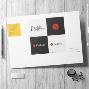
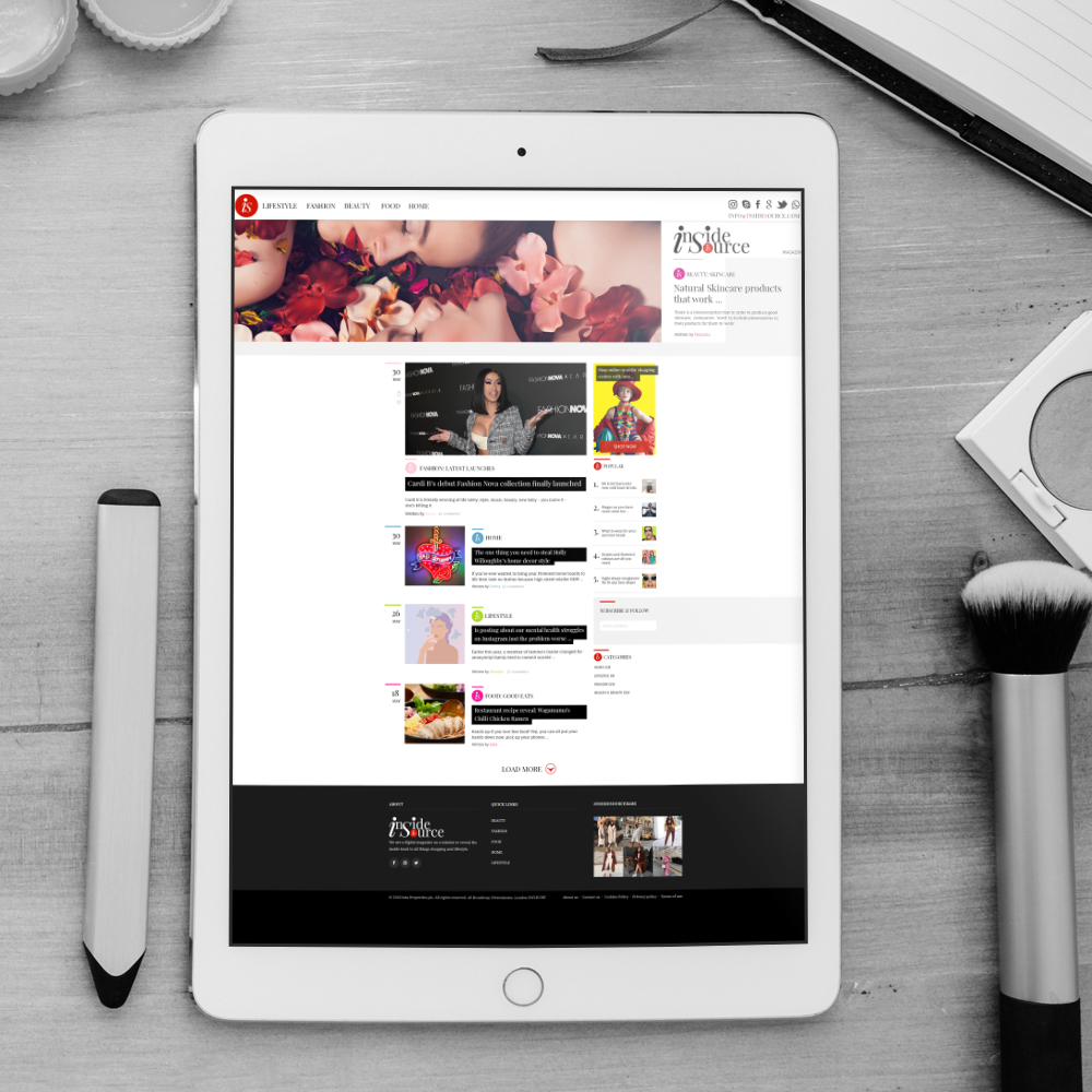
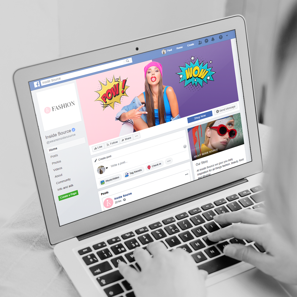
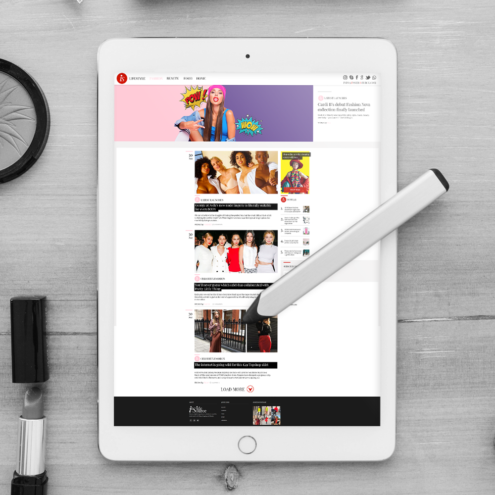
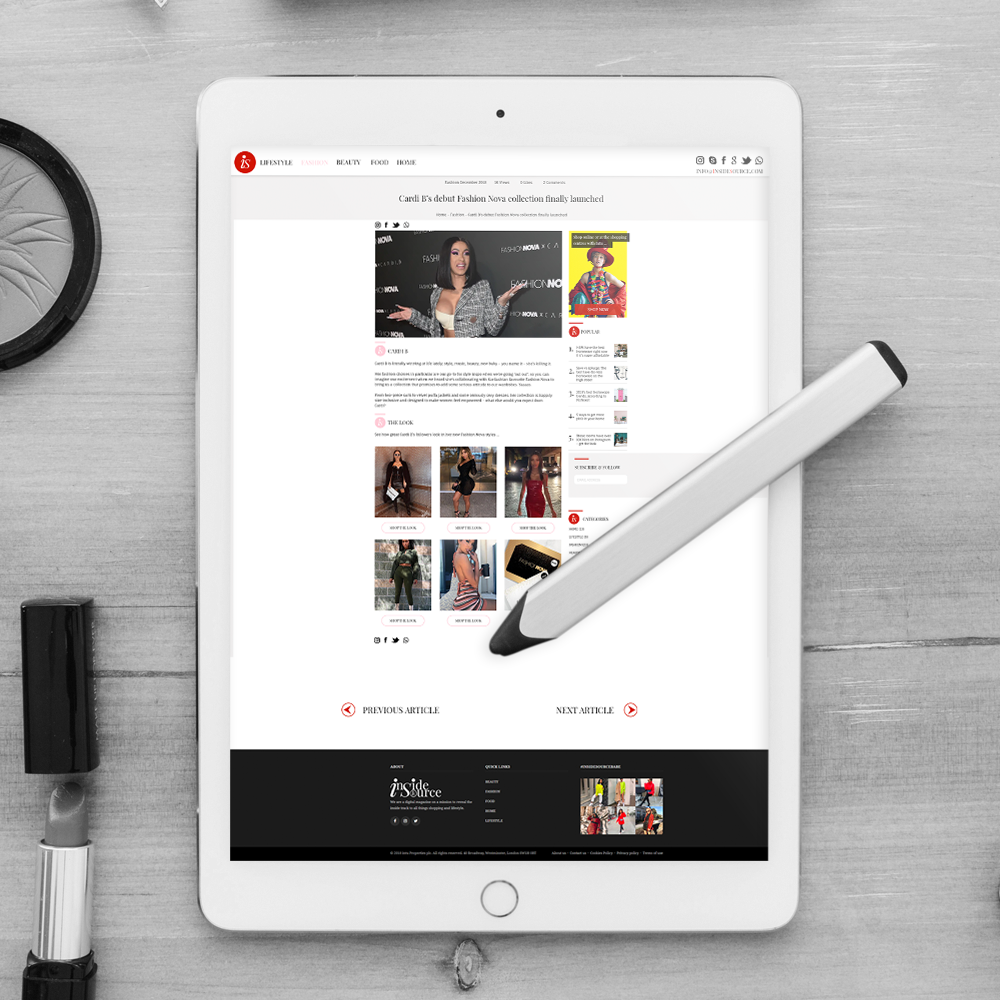
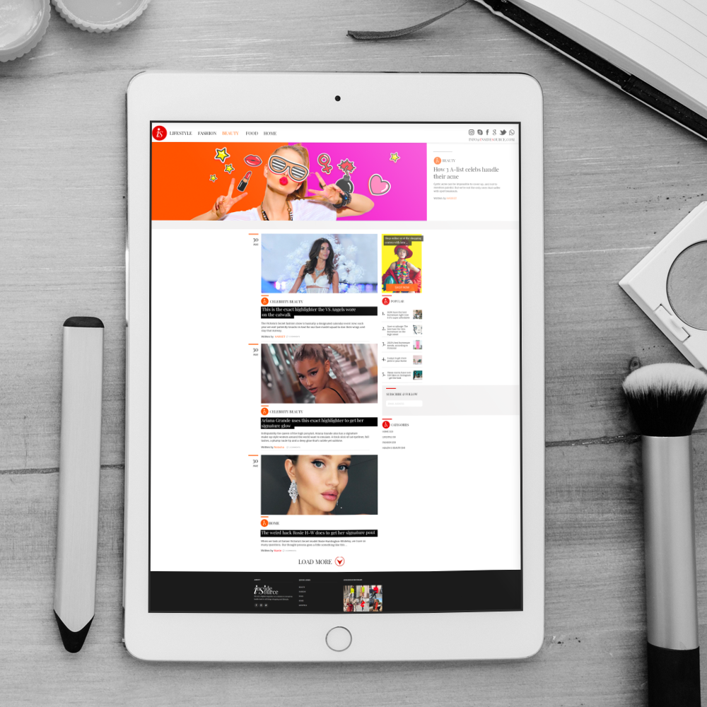
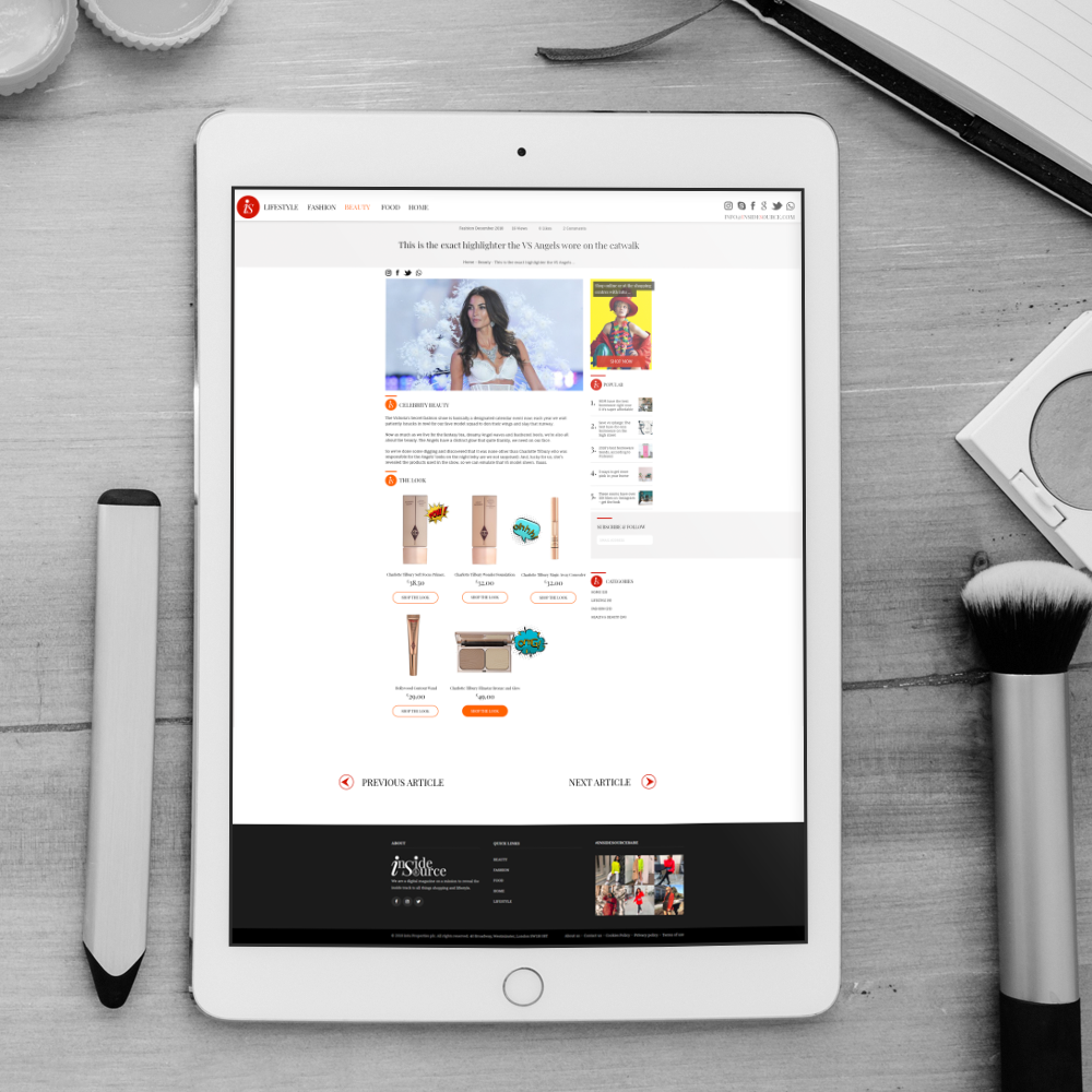
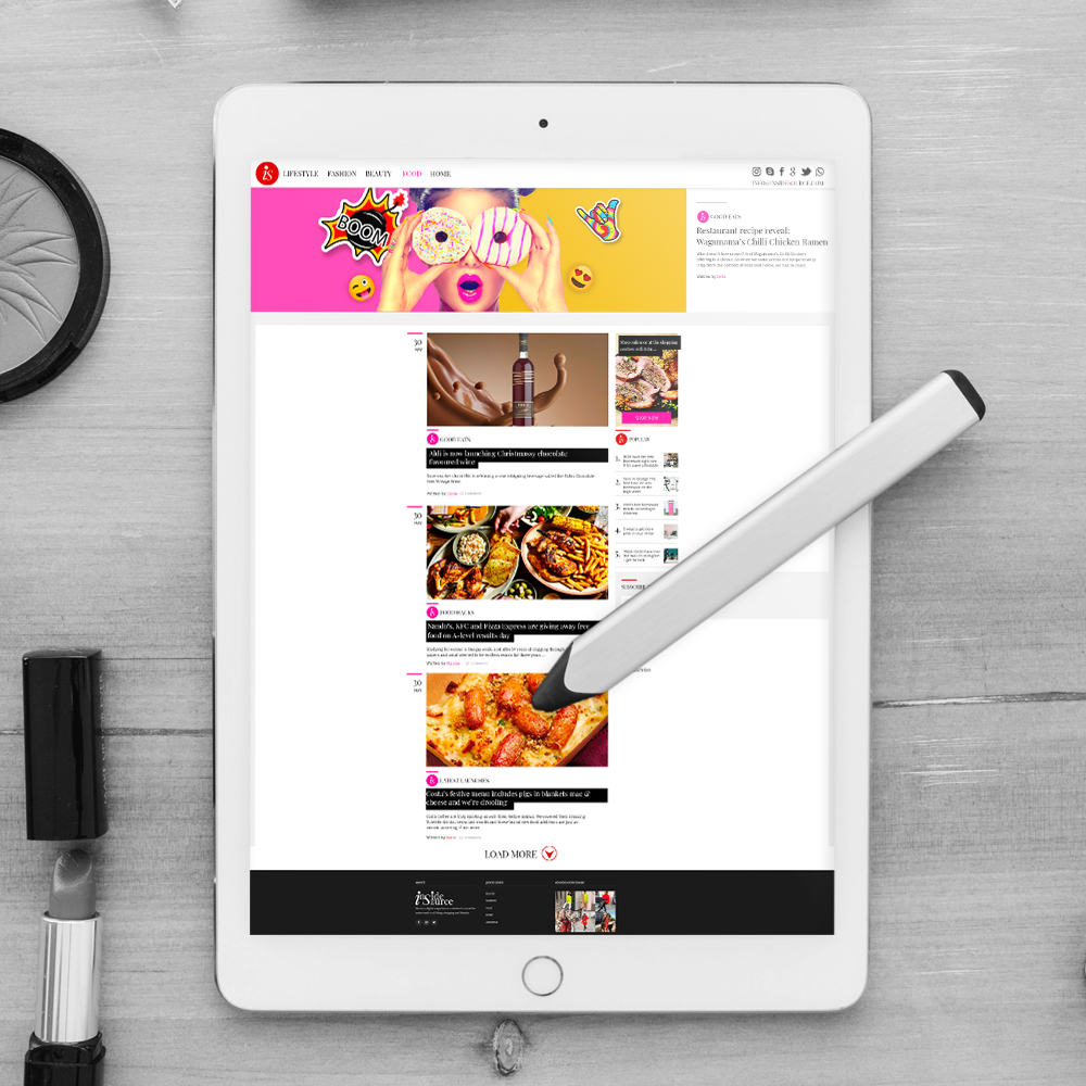
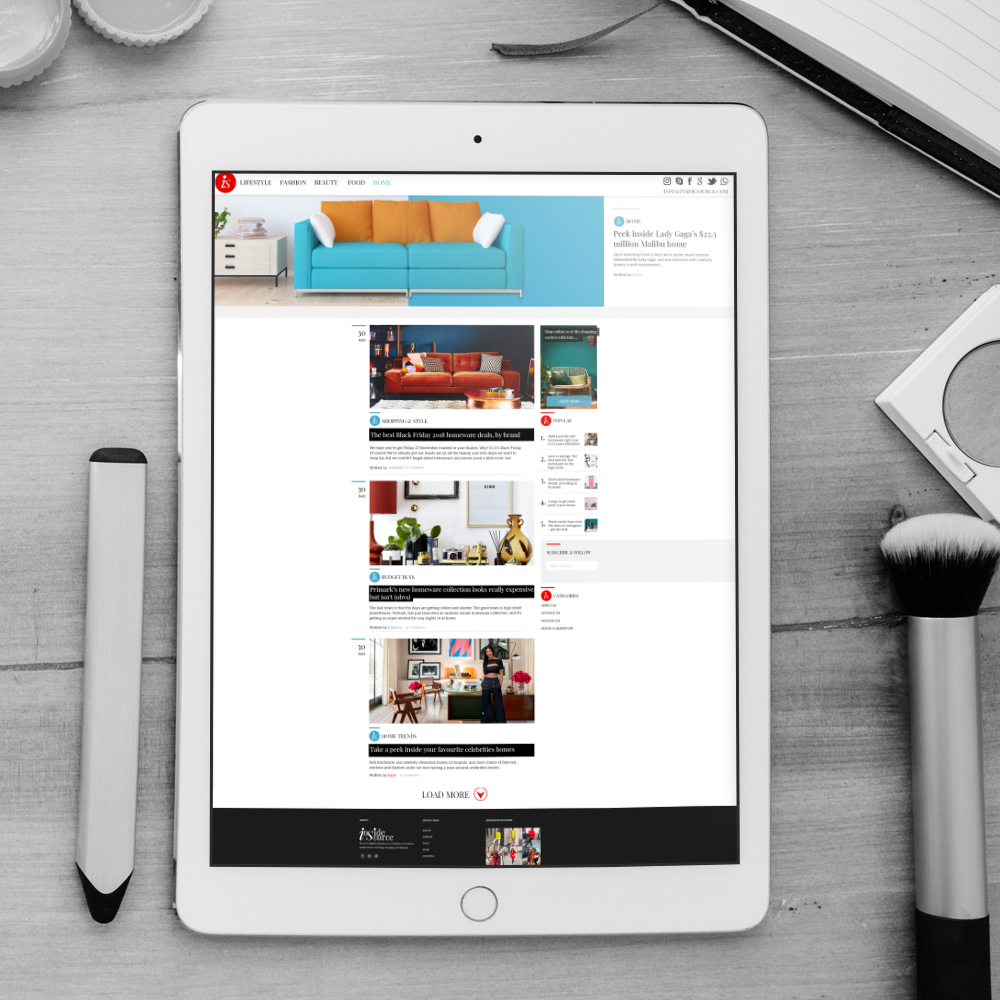
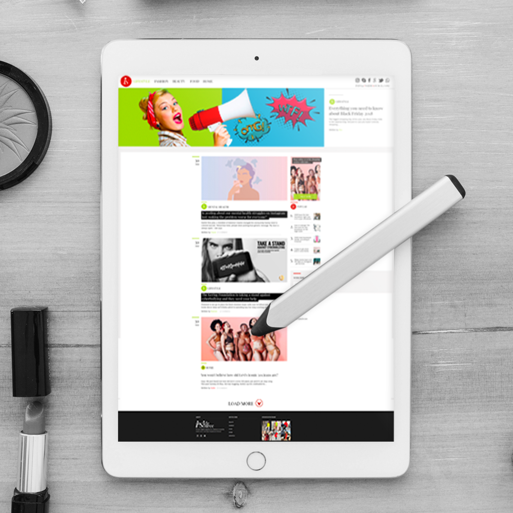
Intu Digital online Magazine, “Inside Source”.
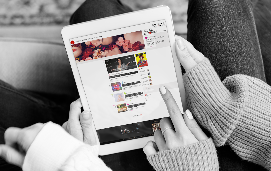
Why?
CAPITALIZING ON A GROWING CONTENT AUDIENCE
In order to capitalise on the growth and engagement achieved with their Shop Insider magazine (150% YoY), my task was to help establish a strategy for a new intu branded online magazine as a credible, insightful and industry-leading publication, capable of competing with the likes of Cosmopolitan UK, Grazia and Refinery29 UK.
INITIAL IDENTIFIED ISSUES
Intu is a credible shopping centre brand and not a digital magazine brand.
Twinning the two is confusing readers as to what Shop Insider is and making it more difficult to establish a presence against our competitive set
Minimal cross over from our shopping centre digital audience.
What?
REBRANDING MAGAZINE
The rebrand will require a number of elements including:
New name
New contemporary, considered design.
New CMS, designed specifically for publishing.
CMS to increase in production, marketing of reactive, proactive and speedy content.
Where?
CLIENT
Intu Digital
PROJECT INFO
Lead Paul Cleghorn, (Contract)
WHAT WE DID
Research, Strategy, Innovation, Branding, Hands-on UX/UI, Final design, Social Channels, Testing, Budget, Source Tech.
Empathize & Define
Assuming a Beginner’s Mindset
BECOMING THE BEGINNER USER
When starting a new project ASC prefer NOT to be taken through the website, product, app or software by the client. I prefer to come to project as a beginner user to identify issues, improvements and innovations, before being given any prior knowledge.
The only takeaway’s from the testing was the site wasn’t built or designed for purpose.
Demographic, Personas, UX Plan
WATCH, DIGEST, LEARN
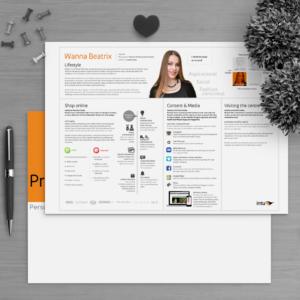
From the initial research the demographic of the user was identified to be, Millennial, female 18-34yrs old. Also we recorded pains points, challenges and goals, this produced a UX/UI framework of research to take to next stage.
The artifact produced from this stage of the project was the UX Plan and Brief documentation.
Ideation
STAKEHOLDER, TEAM BUY-IN
At Intu I took the whole digital department through ideation, about 50 employees. These idea’s were synchronized to establish, narrative, patterns, technical issues, innovations.
The artifacts produced from this stage were the user needs hierarchy, UX, UI content and technical requirements.
Prototype & Testing
Info Arch, User Journey …
PATHS, AI, CONTENT BLOCKS IDENTIFIED
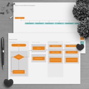
Once we had synchronized the ideation we could start to produce the information architecture, flows and user journeys.
Artifacts produced from this stage include diagrams of IA, UX, UI, this is the framework for the wireframes and the prototypes.
Wireframes
INITIAL SKETCHES, LO-FI WIREFRAMES
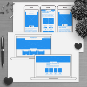
ASC like to rapid, red dot, prototype with the team. We then produce the first Lo-Fi wireframes, adding the layer over the User Journey, flow diagrams. This is when we start testing the designs.
Artifacts produced from this stage are testable wireframes and prototypes.
Project Gallery
What we did
Tasks were planned and completed in just over 4 months by Paul Cleghorn, Founder, Manager, Designer.


